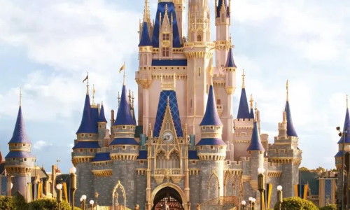
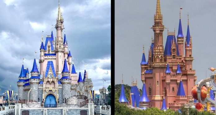
The transformation of Cinderella Castle at Walt Disney World has been met with mixed reactions by Disney fans. As darker blue paint has been added to the turrets and pink paint has been added to the walls, the castle’s iconic appearance is now quite different. Every photo that has come out seems to depict Cinderella Castle in a different way.
The filters the Disney community has added to their photos and the different lighting makes getting a realistic look at Cinderella Castle almost impossible. Consider the photos below. You can see why opinions of the transformation are all over the place.
First, a view from very close to Cinderella Castle.
Further down Main Street U.S.A., things look similar. However, they noted that they did edit the photo to make it lighter and adjusted the saturation.
Again, this photo has been edited.
Views from further away under different lighting and different image filters make the pink look much darker.
There the pink looks more like a salmon color.
Aerial images look like a mix of the lighter and darker colors.
The new Cinderella Castle may need to be viewed in person before any Disney fans can draw firm conclusions. But, it is worth noting that the change draws quite a few comparisons to Sleeping Beauty Castle, for better or worse.
Some hoped for something closer to the reimagined castle at Toyko Disneyland Resort.
Going back to the concept art, we can see why the images of the darker pink have confused so many.

The concept art shows more golden accents and a much lighter pink.
It’s worth noting that work is still taking place on Cinderella Castle at this time. We can’t fairly judge the transformation until everything is completed. So far, everything has turned out much darker and plastic-y (for lack of a better word) than we would have hoped.
Time will tell how Cinderella Castle’s new look will be viewed. Guests returning to the Magic Kingdom beginning July 11 will take a ton of photos of the new appearance, hopefully adding clarity to this conversation.


